Heybox
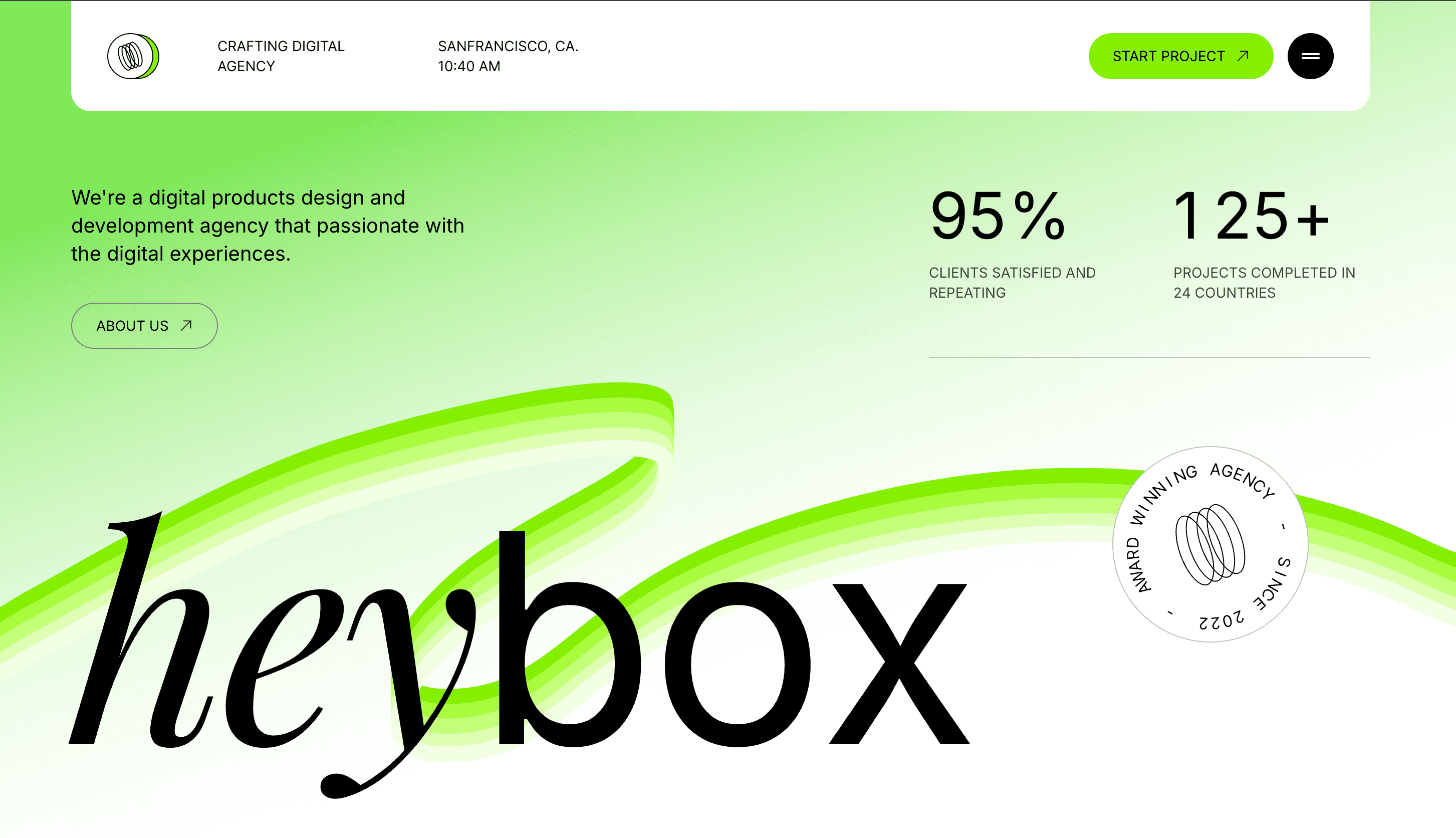
A creative agency landing page where motion, typography, and performance work as one system.
- Frontend Developer & Designer
- 2025
- In progress
Summary
Heybox is a creative agency landing page I designed and built to showcase what a premium digital studio homepage can feel like in motion. The experience leans on GSAP for scroll-linked and entrance animations, paired with deliberate typography and spacing so every section reads clearly before it moves. Performance and responsiveness were treated as core requirements—not polish at the end—so animations stay smooth, layouts adapt cleanly, and the page remains fast on real devices.
- GSAP scroll and entrance animations tuned for smooth, intentional motion
- Strong visual hierarchy with serif display type and clear content zones
- Responsive layout that preserves rhythm and readability across breakpoints
- Performance-first implementation — lean assets, GPU-friendly transforms, reduced-motion support
Tech stack
Tools and technologies used to design, build, and ship this project.
- React
- Next.js
- TypeScript
- GSAP
- Tailwind CSS
- Figma


Case studies
How we framed the problem, what we tried, and what changed.
01
Motion that supports the story, not the other way around
Agency sites often over-animate. Heybox uses GSAP to guide attention—revealing stats, ribbon graphics, and CTAs in sequence rather than all at once.
- Challenge — Landing pages for creative studios tend to pile on effects that look impressive in a demo but feel heavy in the browser—janky scroll, layout shift, and motion that competes with the message.
- Approach — I scoped animations around what each section needs to communicate: staggered stat reveals, a flowing ribbon graphic that anchors the hero, and subtle hover states on primary actions. Transforms and opacity lead; expensive properties are avoided. ScrollTrigger timelines are scoped and cleaned up so interactions stay predictable on resize.
- Outcome — A homepage that feels dynamic and crafted while staying performant—motion reinforces hierarchy instead of masking weak layout or typography.
02
Typography and hierarchy as the foundation
Before animation, the page needed a clear type system and spatial rhythm so content worked even with motion turned off.
- Challenge — Agency landings mix brand expression with dense information—location, stats, positioning copy, and multiple CTAs—without turning into visual noise.
- Approach — I established a tight typographic scale: a large serif wordmark for brand presence, restrained sans-serif for navigation and body copy, and high-contrast accent green for actions. Spacing and grid rules keep the nav pill, hero copy, and stats row balanced on wide screens and stacked cleanly on mobile.
- Outcome — A cohesive visual system where responsiveness feels intentional—sections reflow without losing emphasis, and the page reads clearly at every viewport.
03
Fixing scroll lag on a heavy, animated page
A long landing page with ten animated sections, a 3D globe and smooth scrolling can easily stutter, especially on phones and on the first load.
- Challenge — Loading every section at once meant a lot of JavaScript and layout work competing with the hero animation. Every section that loaded made the scroll animations re-measure the whole page, and the page lagged each time.
- Approach — Every section below the hero is code-split and lazy-loaded. While the preloader plays, the browser uses its idle moments (requestIdleCallback) to download those sections one at a time. When the preloader opens, the sections mount one per idle moment rather than all together, so the hero's entrance never drops frames. The re-measuring after sections mount is batched into one pass instead of one per section. Pinned sections use CSS position: sticky instead of GSAP's pin, because the pin broke under the page's CSS zoom on wide monitors. Expensive scroll-linked effects, like the page-wide marquee and scroll-driven rotation, run on desktop only.
- Outcome — The hero opens smoothly and scrolling stays fluid while the rest of the page loads behind it. Phones skip the heaviest effects and get lighter alternatives.
04
Animation that runs on the GPU, not the main thread
Motion is the core of the Heybox experience, so it had to stay smooth on every device and never fight the layout.
- Challenge — Scroll-linked carousels, a brush stroke that draws as you scroll, magnetic hover effects and entrance animations all run at the same time. Naive implementations cause layout thrashing, flicker when animations end, and wasted work for elements that aren't on screen.
- Approach — Almost everything animates only transform and opacity. Cursor-following effects use GSAP's quickTo, so they don't create a new tween on every mouse move. Scroll-driven work is scrubbed to one timeline per section. The brush stroke, the globe's rotation and the card slide all share a single progress value. Every GSAP setup lives inside useGSAP and matchMedia, so it cleans up properly on unmount and on breakpoint changes. Around 20 components respect prefers-reduced-motion, and people who turn motion off get a static, complete layout. On mobile, the review cards become a swipeable Framer Motion stack instead of the scroll-driven desktop board.
- Outcome — Animation that feels crafted without costing performance. Every effect can be traced to one timeline, is cleaned up properly, and can be switched off.
05
Image optimisation and render strategy
The page carries over 60 images: project shots, team portraits, press thumbnails and a full-bleed hero background.
- Challenge — Large images slowed the first load, and photos below the fold popped in late while scrolling. The site is also scaled up to fill very wide monitors, so images still had to look sharp at 2–2.5× their normal size.
- Approach — A sharp build script (npm run optimize:images) resizes each image to its real display size, multiplied for retina screens and the wide-monitor zoom, then re-encodes it as WebP at quality 80. For example, project shots are capped at 1600px, Process thumbnails at 640px and team portraits at 480px tall. The hero background is preloaded with fetchPriority="high". The first below-the-fold photos download while the preloader is still showing, and the rest when the browser is idle. Images use loading="lazy" and decoding="async", except the first project cards, which load eagerly.
- Outcome — The images are right-sized for how they're actually shown, the hero background is a WebP of about 15 KB, and photos are usually already loaded by the time you scroll to them.
06
A 3D globe that only costs something when it's on screen
The client reviews section has a 3D line-drawn globe that turns as you scroll through the testimonials.
- Challenge — WebGL is the most expensive thing on the page. A globe that renders every frame, at full pixel density, on every device, drains battery and competes with the scroll animations.
- Approach — Three.js is code-split into the reviews section's own chunk, so it isn't part of the first page load. The globe is only mounted on desktop; on mobile the section switches to the swipeable card stack. The render loop is paused while the globe is off screen, using an IntersectionObserver. Pixel density is capped at 2×, and resizing is handled by a ResizeObserver rather than a window resize listener. The globe's rotation follows the same scroll progress as the review cards and brush stroke, so there's no second scroll listener. With reduced motion turned on, it holds still. When the section unmounts, every geometry, material and the renderer itself are disposed.
- Outcome — A signature 3D moment that is effectively free when you aren't looking at it, stays in sync with the scroll story, and doesn't leak GPU memory.
Let’s connect
I’m always open to discussing new projects, creative ideas, or opportunities to be part of your visions. Just reach out!