Archiora
An architecture agency site where bold imagery, clear services, and motion sell the craft before the first consultation.
- Frontend Developer & Designer
- 2025
- Shipped
Summary
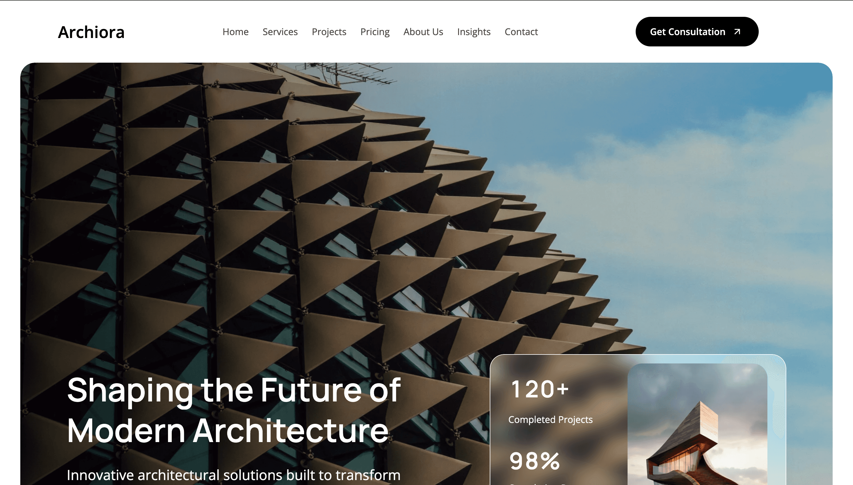
Archiora is an architecture agency website I designed in Figma and built with React, Tailwind CSS, shadcn/ui, and GSAP. The site positions the studio around modern residential and commercial work — leading with a cinematic hero, project stats, and a clear path to consultation. Motion is used to reveal content on scroll without competing with the photography, and the component system keeps layouts consistent from hero through services, pricing, and contact.
- Cinematic hero and project photography anchored by strong typographic hierarchy
- shadcn/ui components for navigation, CTAs, and reusable layout primitives
- GSAP scroll reveals that pace content without overshadowing the architecture
- Fully responsive — services, projects, and consultation flow adapt cleanly across breakpoints
Tech stack
Tools and technologies used to design, build, and ship this project.
- React
- Tailwind CSS
- shadcn/ui
- GSAP
- Figma



Case studies
How we framed the problem, what we tried, and what changed.
01
Letting architecture lead the first impression
Architecture firms sell through visuals first. Archiora opens with full-bleed project imagery and a single headline that frames the studio's ambition.
- Challenge — Agency sites often bury their best photography under UI chrome, dense copy, or generic stock layouts that could belong to any industry.
- Approach — I designed the hero around one strong photograph and a restrained overlay — headline, subcopy, and a primary consultation CTA. A frosted stats card surfaces project count and completion metrics without breaking the immersion of the image.
- Outcome — Visitors understand the studio's caliber within seconds and have an obvious next step to book a consultation.
02
A component system that scales across the site
Beyond the hero, Archiora needs consistent patterns for services, project grids, pricing, and contact — without rebuilding every section from scratch.
- Challenge — Architecture sites mix editorial layouts with functional UI. Inconsistent spacing, buttons, and cards make the experience feel stitched together rather than designed.
- Approach — I prototyped the full site structure in Figma, then implemented with Tailwind CSS and shadcn/ui for buttons, navigation, and cards. GSAP handles section entrances and stat counters while keeping motion subtle enough for a professional audience.
- Outcome — A cohesive site that reads as one product — fast to extend, consistent on mobile, and live at scale on Vercel.
Let’s connect
I’m always open to discussing new projects, creative ideas, or opportunities to be part of your visions. Just reach out!